This Portfolio – Built From Scratch
Why I skipped templates and built a custom multilingual site
UXfolio felt rigid, and Behance is nice, but not my format. I wanted a site that could grow with me, reflect my identity, and showcase real product thinking with my skills in action – so I designed, wrote, and coded it myself.

Project in a Nutshell
My role
UX/UI Design, UX Writing, Brand & Logo, Front-end, Localization (EN → DE/RU), Publishing
Timeline
~1 month of irregular after-work evenings
Tools
Figma, VS Code, Tailwind, GitHub Pages, HTML/CSS/JS, ChatGPT, Google Docs, CodePen
Challenge
Define a professional identity, design a fitting logo, and build a polished, responsive portfolio without relying on templates – all while not being a full-time developer. The goal was to get everything running quickly and keep it easy to maintain.
Objective
Build a responsive, brand-worthy, multilingual site that tells my story clearly, presents case studies in a consistent way, and gives me full control over content, code, and growth.
Highlights
- Custom identity and logo aligned to my voice and work
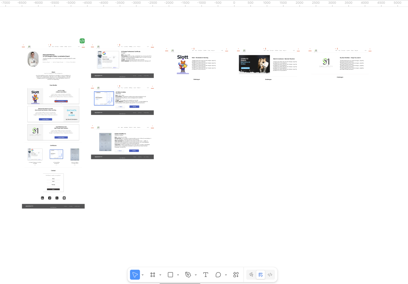
- Reusable case‑study layout for consistent storytelling
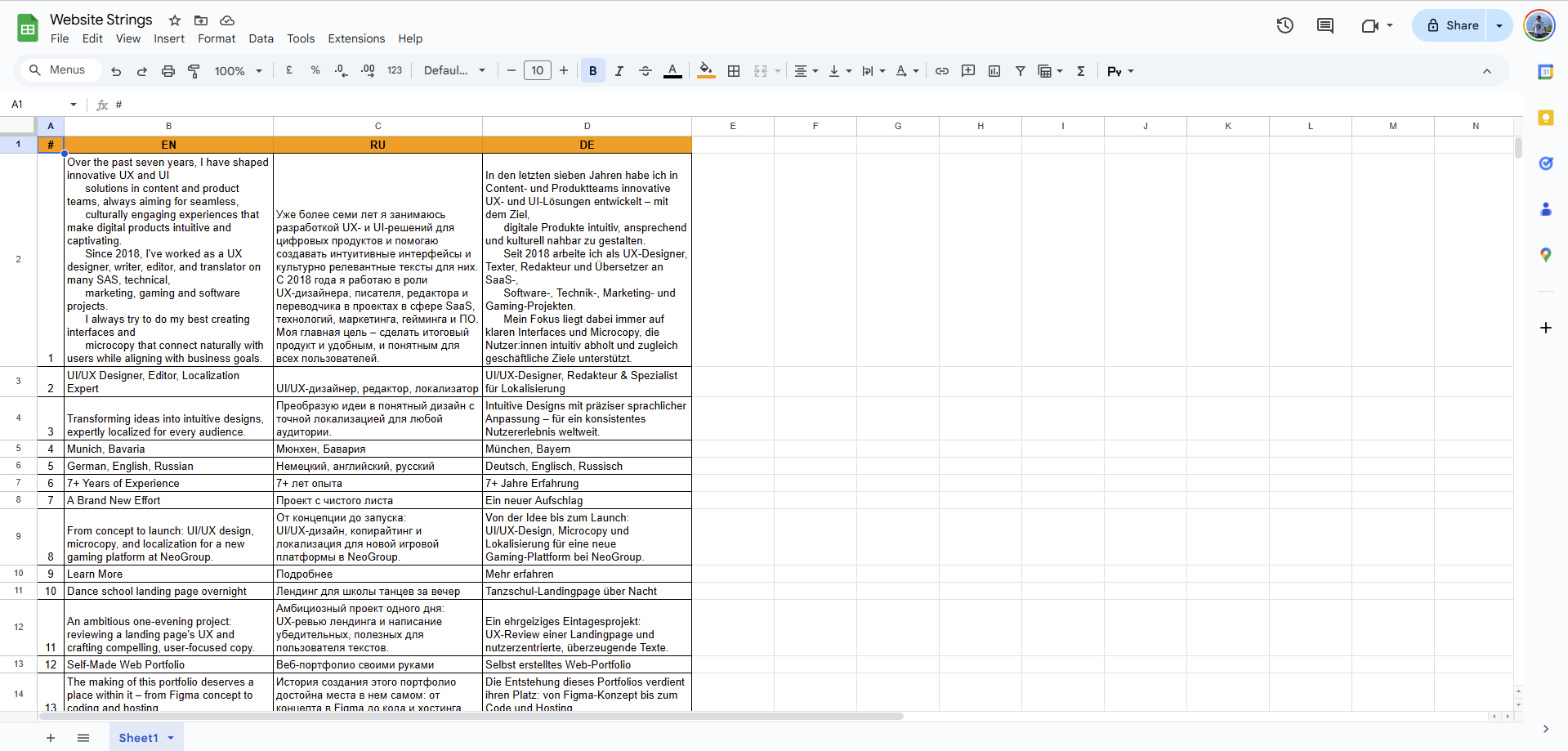
- Multilingual structure (EN → DE/RU) planned from day one
- Fast static stack with Tailwind on GitHub Pages
- Accessible, scannable typography and spacing system
Outcome
- A site that feels personal, trustworthy, and ready to grow
- A sharper story around skills, process, and real impact
- Full control over hosting, speed, and SEO essentials
- No vendor lock-in – everything runs from my repo
- A responsive website I own to the last character and pixel
Process
I approached this site like a small product: shipable chunks, honest constraints, and fast learning. The goal wasn't just “a website,” but a clear, evolving system that could grow alongside my work.
- Find the voice. I sketched directions, gathered visual references, and defined a tone that feels simple, confident, and warm.
- Shape the identity. In a few hours, I created the logo and tested how well it reflected me and how it looked in mockups.
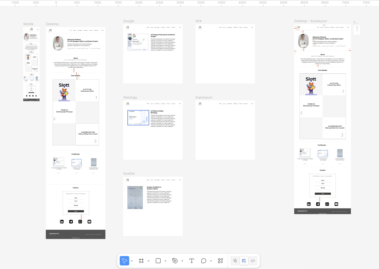
- Map the work. In Figma, I drafted the first pages to launch – Home, About, Case Studies, Contact – starting desktop-first, with mobile right behind.
- Prove the rhythm. I built interactive mocks to test flow, spacing, and reading pace before writing any code.
- Refine what matters. Explored several iterations of the final design and chose the one that worked best.
- Build like blocks. With HTML/Tailwind CSS/JS, I set up component-based sections and pulled in a bit of ChatGPT to speed up the repetitive work.
- Go multilingual. Wrote in English first, then localized into DE/RU while keeping tone and clarity intact.
- Ship, check, iterate. Published on GitHub Pages, tested on real devices, and documented choices to keep future edits simple.
Key Decisions & Design Principles
Instead of forcing a “before vs. after,” I've outlined the choices that shaped this site and the principles that kept it cohesive – decisions made to keep the design clear, adaptable, and true to my work.
Decisions in Focus
- Build from scratch, no compromise: full creative control, stronger performance, and a brand home that truly fits me. Plus, a deliberate investment in learning.
- Custom logo over a font-only wordmark: a mark with personality that works across favicon, social, and print – designed to feel modern and approachable.
- Desktop first, then mobile: since case studies are mostly read on desktop, I shaped the flow there first – making mobile adaptations cleaner and faster.
- Manual localization: tone, terminology, and context matter. Careful translation creates more trust, better UX, and stronger SEO than automation ever could.
Design Rules in Practice
- Clarity: clear hierarchy in case studies so role, outcome, and impact are visible at a glance.
- Consistency: a spacing scale and typographic rhythm that hold pages together; reusable blocks align text and design.
- Identity: logo, tone of voice, and colors build a calm, approachable brand – consistent from hero to footer.
- Flexibility: built as a system (Tailwind + modular content), so adding new case studies can be done quickly and efficiently.
Impact
This project reshaped the way I approach design and projects as a whole. I picked up new skills, honed the ones I had, and experienced the full power of creative freedom – without paywalls or platform constraints standing in the way:
- Readability. Clear hierarchy and consistent patterns make long pages easy to skim.
- Craft. A custom logo and tone give the portfolio a distinct, human voice.
- Ownership. Content and code live in my repo – no lock-ins, no plugin roulette.
- Localization. A manual approach keeps nuance and credibility intact.
- Performance. A lightweight static build keeps pages fast and stable.
- Dev empathy. The project gave me a better taste of what engineers face day to day.
Learnings
Building this site wasn't just about design – it was a massive challenge in shipping a product end-to-end. I learned to juggle identity, structure, and code while keeping the focus on clarity and usability.
-
Systems thinking. Clear spacing and grid rhythm saved hours once coding began.
-
Design → code flow. Tidy Figma components translated directly into cleaner HTML/CSS.
-
Localization awareness. Planning for EN, DE, and RU early prevented layouts from breaking.
-
Momentum over perfection. The most effective rule: build it first, improve it later.