Bachata School – Clearer Words, Better UX
From cluttered copy to a clear, conversion-driven site in just one evening
This was a full UX writing and content-structure sprint. I reviewed the site end to end, mapped pain points, and rewrote the key sections so newcomers could quickly grasp the offer, check pricing, and contact the coaches. The result was a friendlier site that's easier to scan and act on.
Project in a Nutshell
My role
UX Writing and Review, IA cleanup, microcopy & CTA design, and refinement of EN localization
Timeline
One evening: review → proposal → second-pass QA
Tools
Google Docs (spec + rationale), Tilda (site platform), Figma (quick comps)
Challenge
No access to the client's Tilda account, so all changes had to be documented in a clear, reproducible spec with reasoning and examples. After the client shipped updates, I ran a second-pass QA to catch gaps and ensure nothing critical was missed.
Objective
Make the site quick to scan and act on in one sitting: refine the information architecture, clarify offers, simplify pricing and schedules, streamline booking flows, and craft approachable English copy that feels professional to newcomers.
Highlights
- Mapped pain points and rewrote hero, value prop, pricing, FAQs, and CTAs.
- Consolidated scattered info, reducing cognitive load on key pages.
- Refined CTA hierarchy and clarified contact/booking paths.
- Delivered a Google Doc playbook with before/after copy, rationale, and notes.
- Ran a QA check after implementation to verify fixes.
Outcome
- Onboarding feels smoother: visitors find info & pricing faster with fewer clicks.
- Stronger first impression: polished English microcopy boosts perceived professionalism.
- Clearer paths to action led to more inquiries and new student enrollments.
- The site now feels like a friendly invitation rather than a puzzle.
Changes made transparent
All recommendations were kept in one structured Google Doc: a screenshot with quick mark-ups, the original text, and the proposed version right underneath. If a change required a strategic choice, I provided 2-3 focused variants. Otherwise, one clear option kept momentum and avoided “too much choice” paralysis. The client could review, decide, and implement quickly.
Before → After Highlights
To demonstrate the impact of my UX writing and design, I've selected three key areas of the site. Each example shows how vague, inconsistent, or hard-to-scan sections were turned into clear, user-friendly experiences that help visitors act with confidence.
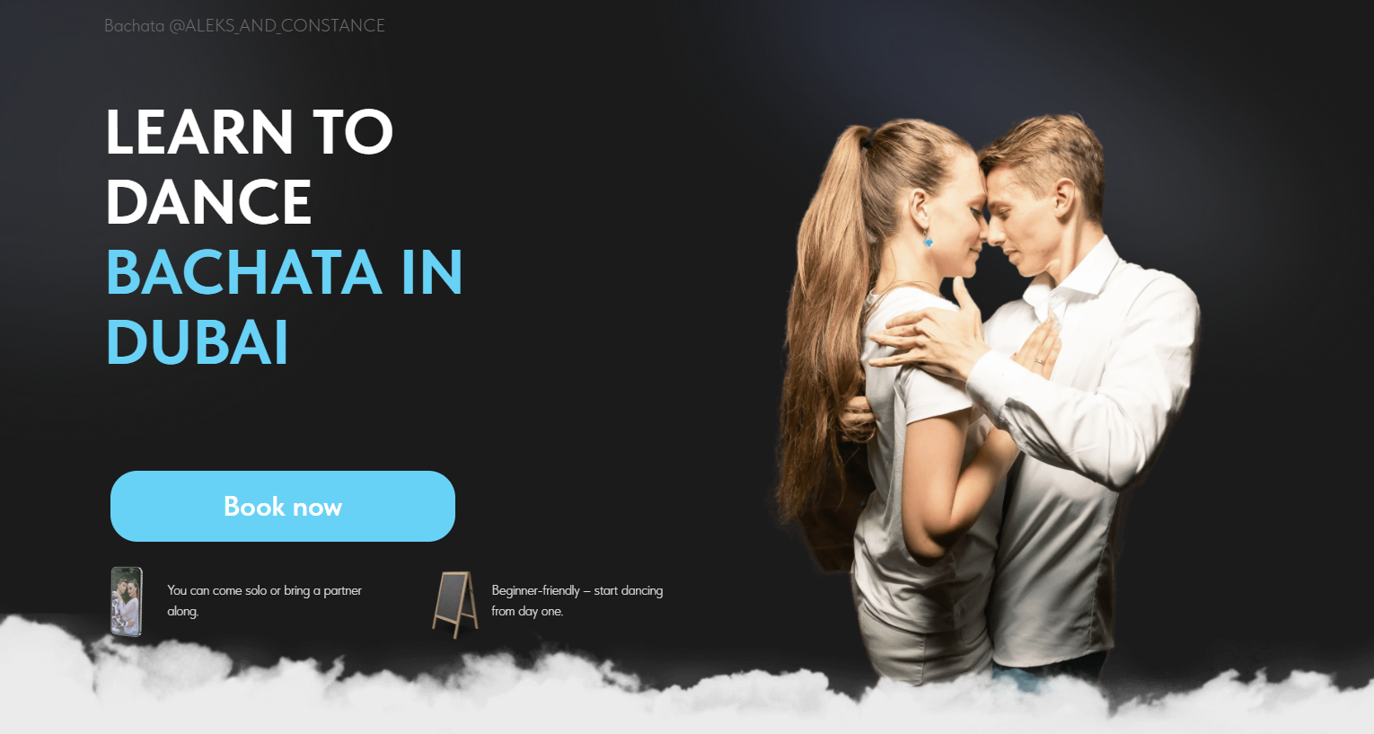
Before: Primary Flow
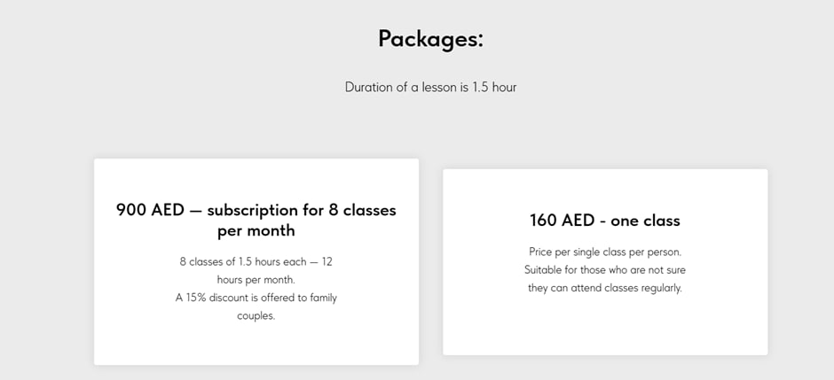
- • No clear “Book Now” button
- • Heavy, less approachable wording
- • Inconsistent card sizes and layout
- • Hard to scan for quick decisions
After: Primary Flow
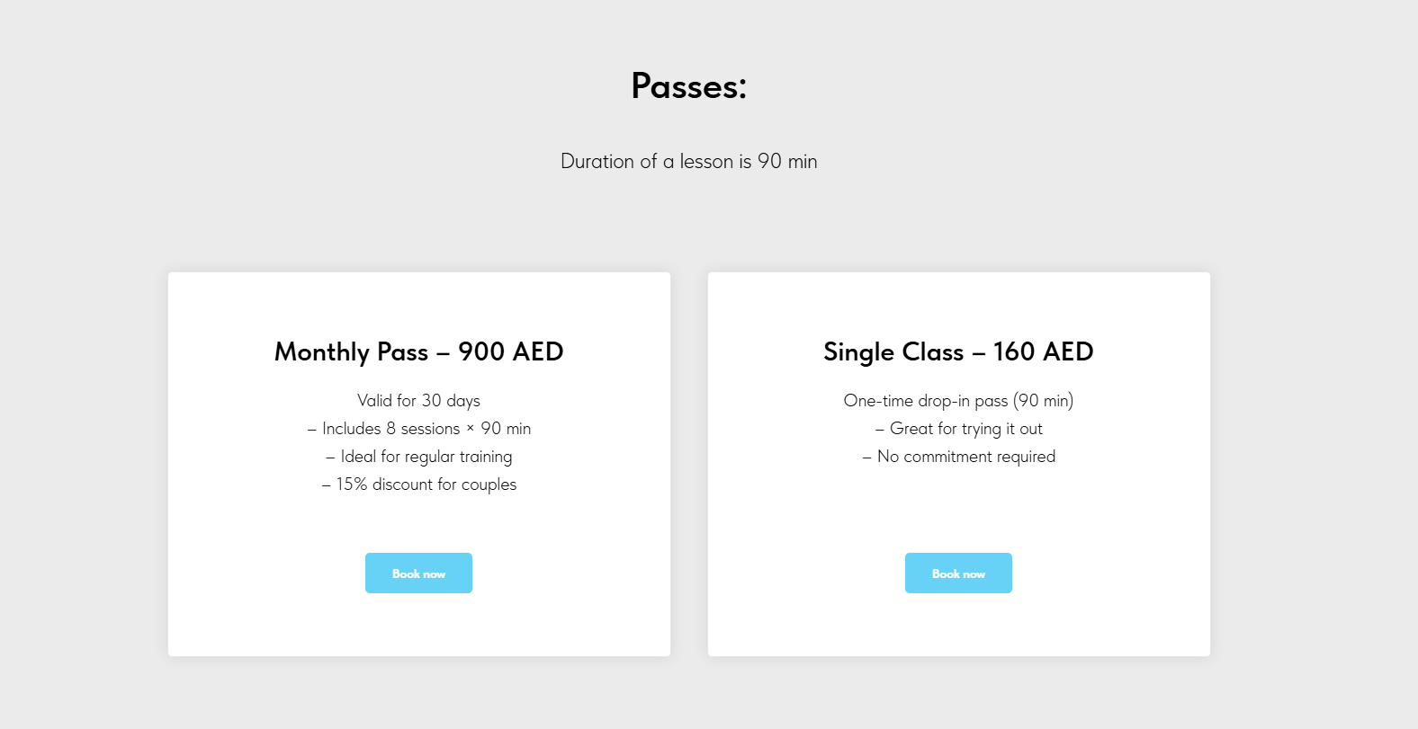
- • Added “Book Now” button
- • Changed “Package” to “Pass” (playful and familiar)
- • Unified card sizes for consistency
- • Refined wording, structure and introduced bullet points
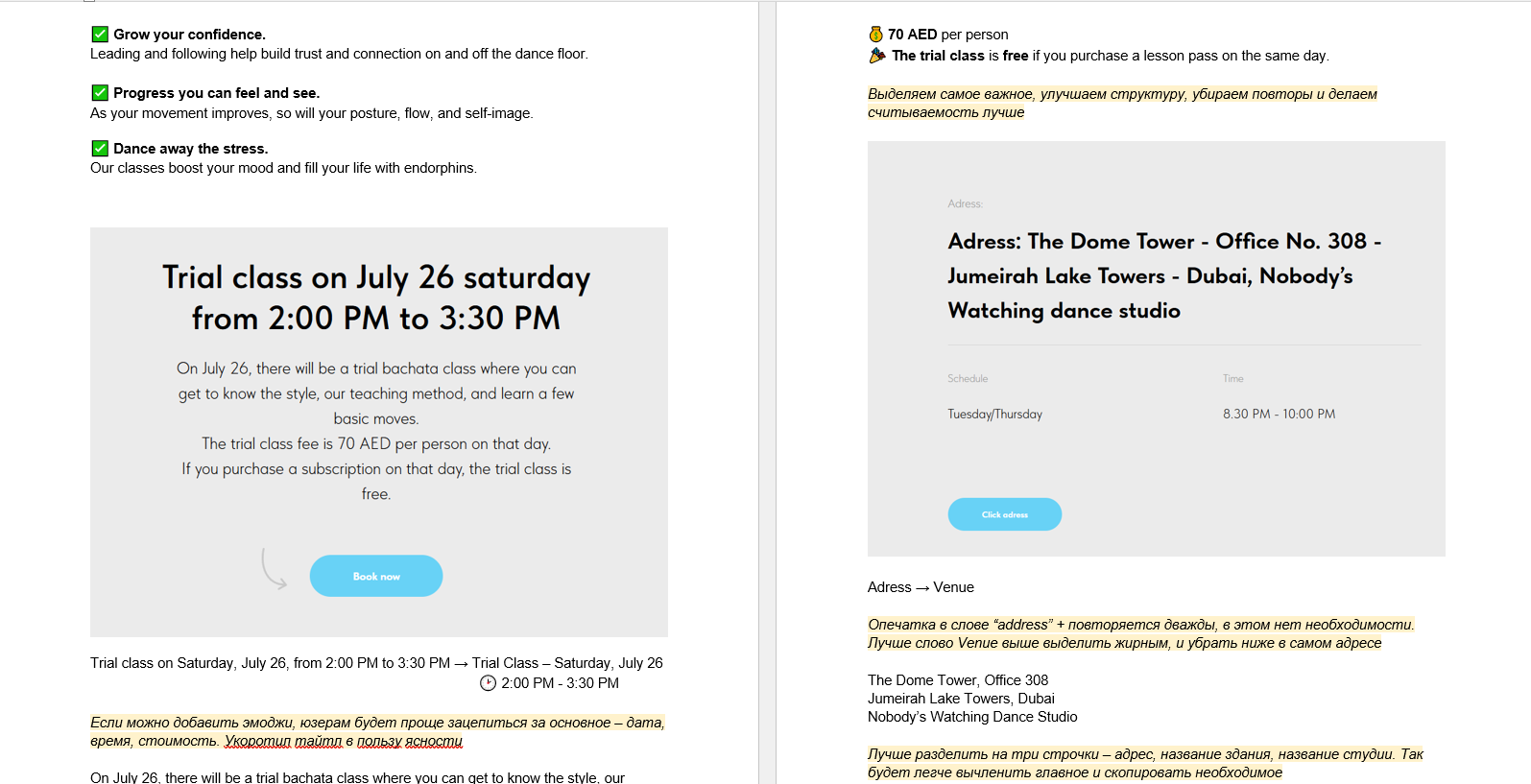
Before: Info Block
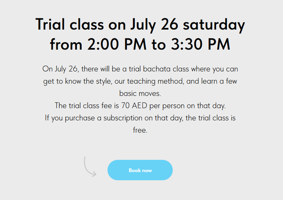
- • Large, uniform text blocks
- • No visual emphasis, hard to skim
- • Key details hidden in long paragraphs
After: Info Block
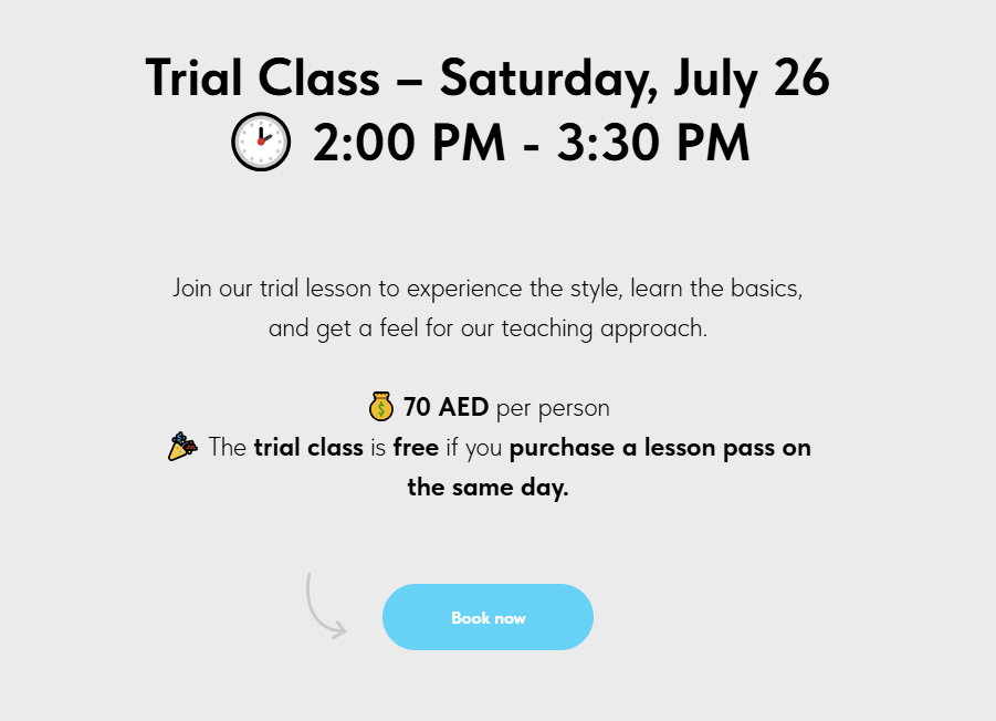
- • Added relevant emojis for easier parsing
- • Shortened text for better readability
- • Highlighted key details in bold for quick scanning
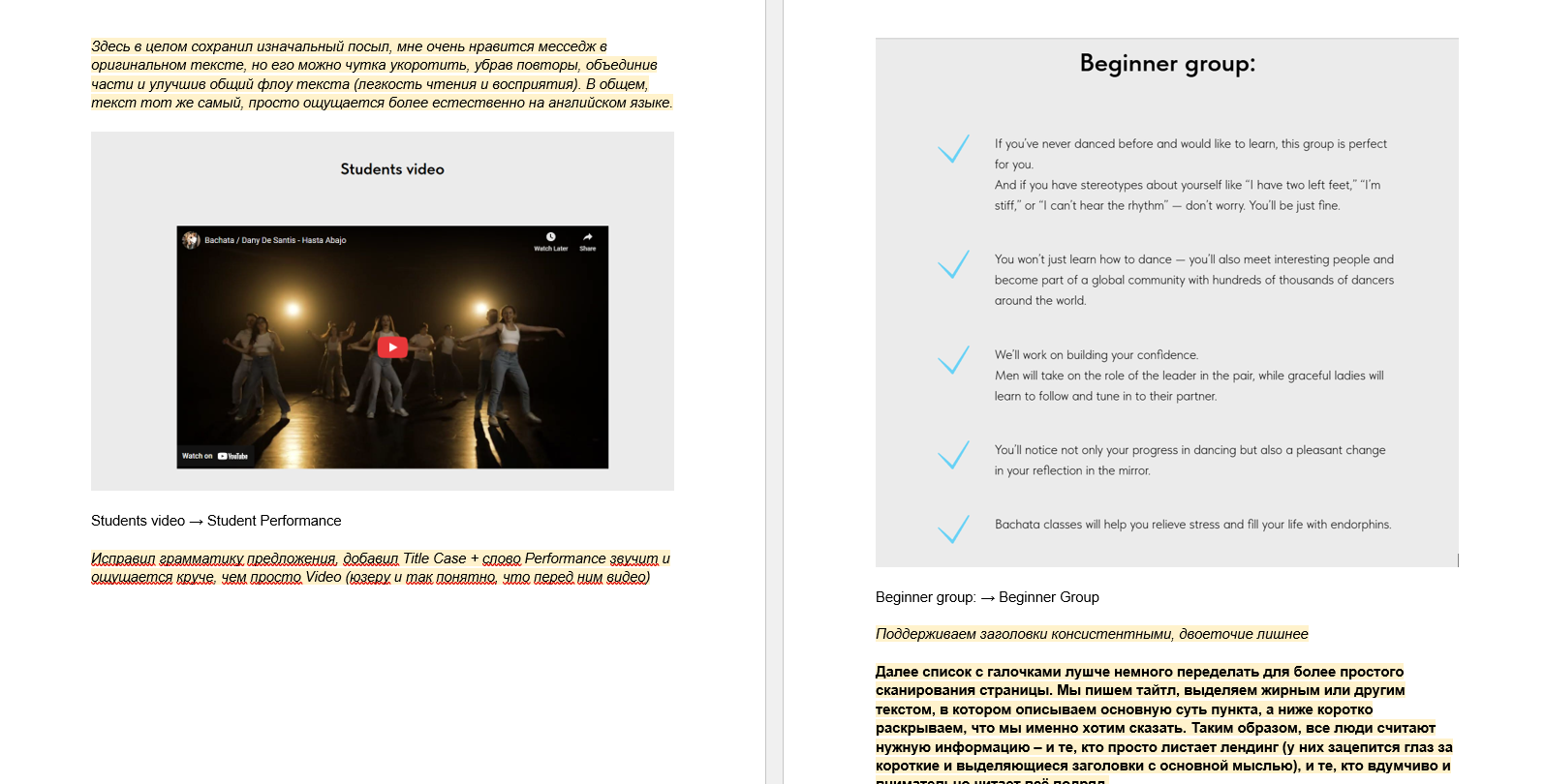
Before: Key Points / Benefits
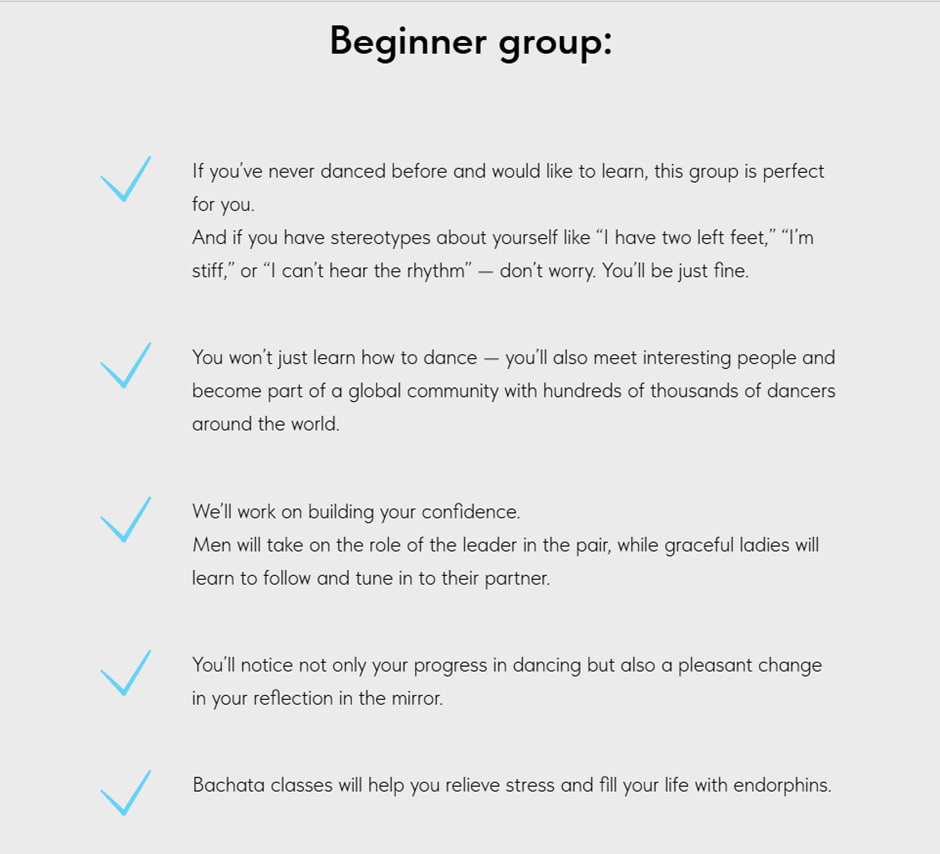
- • Weak or missing headings
- • Long lines with little rhythm
- • Text felt non-native and harder to grasp
After: Key Points / Benefits
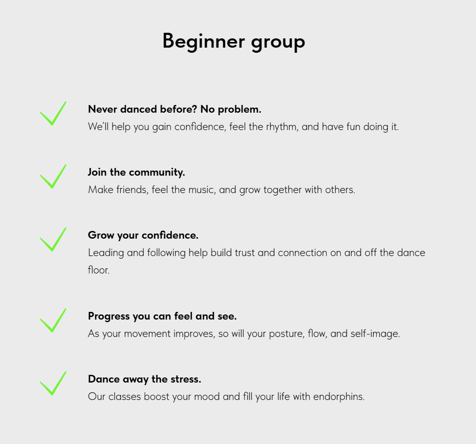
- • Added strong, visible headings
- • Rewritten for clarity & tone
- • Simple, natural phrasing made it much easier to understand
Impact
In one evening, the site became clearer, friendlier, and more action-oriented. The rework removed friction points, made key information easier to find, and gave the school a stronger, more professional online presence. Most importantly, the changes led to more student inquiries and sign-ups, as contacting the coaches and booking a class became simple and obvious.
- Usability: Clearer CTAs, consistent layouts, improved scanability across sections.
- Clarity: Simplified language, less ambiguity, structured content flow.
- Consistency: Unified card sizes, headline patterns, and CTA styles for a professional look.
- Actionability: “Book Now” paths made visible and emphasized throughout.
- Accessibility: Beginner-friendly phrasing with reduced jargon.
- Business Impact: Easier booking process led to more class enrollments (client-reported).
Learnings
This project was another reminder that sharp UX writing can change a product in a matter of hours, not weeks. By tightening the structure, making sections easy to scan, and designing CTAs with intent, the site shifted from overloaded to clear and action-focused.
-
Structure & scanability: sections should be easy to grasp at a glance.
-
Specific CTAs: buttons like “Book now” reduce hesitation and guide users through the main path.
-
Small, surgical edits: tweaks to headings, card sizes, and microcopy can have a big impact.
-
Spec-first workflow: clear “before → after” docs speed up implementation even without CMS access.